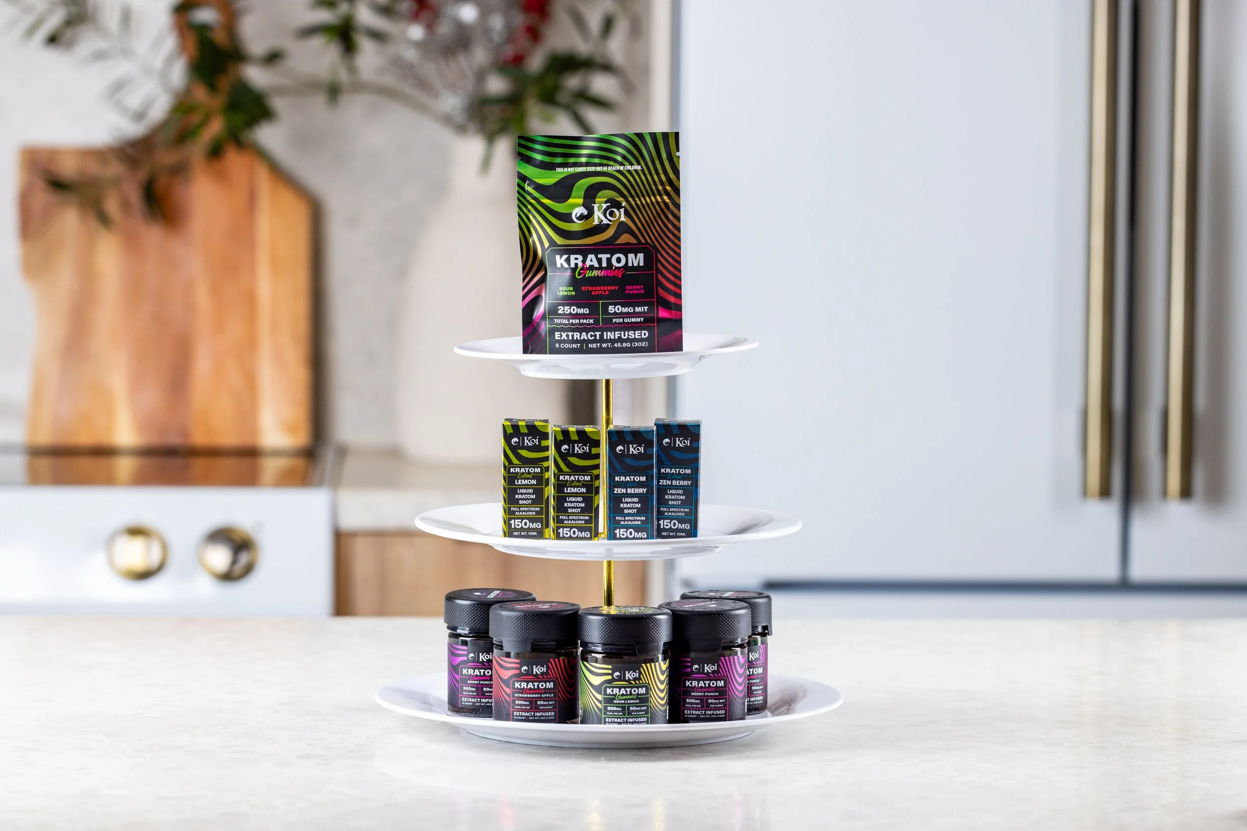
The Most Important Shot in Cannabis Photography (Isn’t What You Think)
When most people think of cannabis photography, they imagine dazzling macro shots of trichomes, buds with resin, dreamy lifestyle images in golden-hour light, or slow-motion flower spins in high-def cinematic glory. And hey — I love that stuff too.
But if we’re talking about what actually drives conversions, influences buying decisions, and moves product off shelves, the most important photo isn’t flashy at all.
It’s the humble menu shot.
Yep. The shot that ends up squeezed into a square on a dispensary website. The one your customer sees while scrolling through hundreds of other products. The one that decides whether they click or keep scrolling.
It may not win you any awards, but it might just be the photo that pays your bills.
Why Menu Shots Matter More Than You Think
In cannabis e-commerce, attention is currency. A potential customer spends less than a second deciding if they’re interested in your product. And what do they see first?
Not your video campaign.
Not your terpene wheel.
Not your gorgeous branded packaging.
They see a menu thumbnail.
Whether they’re browsing Weedmaps, Jane, or your own site, the menu photo is the first impression — and often the only one that matters.
If the photo is flat, fuzzy, off-color, or poorly lit? They’ll scroll on.
If it’s eye-catching, clean, and consistent? Now you’ve got their attention.
And that split-second attention? That’s your foot in the door.
What Makes a Great Cannabis Menu Photo?
Let’s break down what separates a menu photo from a good menu photo — the kind that converts browsers into buyers.
1. Clarity is King
Example of a clean nug menu shot
The product should be in focus, well-lit, and free from distractions. Sounds obvious, but you’d be shocked at how many blurry nugs are floating around out there.
2. Consistency is Crucial
Menu shots are like a visual menu at a restaurant — they should look cohesive. Use the same background, lighting, and angles across your catalog. It builds trust, professionalism, and makes comparisons easier for the shopper.
3. Show the Whole Nug (But Keep It Tight)
Avoid overly zoomed-in shots that crop off the structure. People want to see the size, shape, and trim quality — not just a random patch of trichomes. But don’t back up too far either — you want the flower to fill the frame in a way that feels rich and tangible.
4. True-to-Life Color
Accurate color grading is essential. If your Lemon Haze looks purple or your Purple Punch looks beige, you’ve lost the customer before they even read the description.
But Menu Shots Are Simple… Right?
They look simple. But getting them right? That’s where the challenge lies.
Lighting needs to be soft but punchy.
Color needs to be accurate, not overly filtered.
Focus needs to be sharp — ideally using a macro or high-detail lens.
Backgrounds need to enhance without distracting.
Oh, and you need to replicate that perfect setup every time, across dozens (or hundreds) of SKUs.
Suddenly, it’s not so simple.
How to Make Your Menu Shots Stand Out (Without Breaking the Brand Bank)
If you want to elevate your cannabis menu photos above the sea of sameness, here are a few ways to do it:
1. Use a Signature Background
No, not a galaxy swirl or neon explosion — just a subtle branded touch. Whether it’s a specific texture, color, or setup (like black velvet or recycled paper), this can help make your shots recognizable without being distracting.
2. Play with Light Direction
Most people just blast the nug with light head-on. Try side lighting or backlighting to accentuate texture and trichomes. You can still keep it clean — just with a little more depth.
3. Show Packaging in Context (Optional)
Sometimes, pairing the nug with its packaging — even subtly in the background — can reinforce brand identity without crowding the shot. Just don’t overdo it. This is a menu photo, not a product ad.
4. Hire a Pro (or Train Like One)
If your brand image matters, don’t treat your visuals like an afterthought. Whether it’s a freelance cannabis photographer (wink wink) or training your in-house team, invest in quality visuals. Menu shots are marketing, not just documentation.
TL;DR: Boring? Maybe. Effective? Absolutely.
Menu shots might not get all the glory, but they do get the clicks. They’re the bridge between curiosity and conversion, the quiet MVP of your cannabis marketing funnel.
So next time you’re prioritizing visuals for your brand or dispensary, don’t just chase the flashy stuff. Start with the basics — and master the shot that matters most.
Need Help with Your Menu Photos?
I specialize in cannabis photography that sells — from polished menu shots to cinematic brand campaigns. If you're ready to upgrade your visuals, reach out here or slide into my DMs @ginja.club.
Because in this industry, it’s not just about looking good. It’s about being chosen.

